class | |||||||||||||
| |||||||||||||
| |||||||||||||
property | |||||||||||||
The style list must include one of #'horiziontal and #'vertical.
The Progress.at_value property returns an observable that is updated whenever the progress gauge’s state changes through value as an observable.
See Geometry Management for information about ~margin, ~min_size, and ~stretch.
The ~window_callbacks argument configures callbacks that are common to all WindowChildViews. See WindowCallbacks for more information.
enumeration | |||||
|
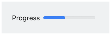
#'horizontal: Creates a horizontal progress gauge, where #'vertical and #'horizontal are mutually exclusive.
#'vertical: Creates a vertical progress gauge.
#'horizontal_label: When the progress gauge has a label, show it to the left of the gauge. Horizontal label placement is the default if #'vertical_label is not specified, and #'horizontal_label and #'vertical_label are mutually exclusive.
#'vertical_label: When the progress gauge has a label, show it above the gauge.