1 Overview
Here’s “Hello, World!” in gui form:
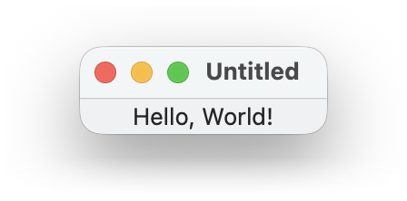
The gui.Window(gui.Label("Hello, World!")) part constructs a view that describes a window containing a “Hello, World!” label. Calling the WindowView.run method of the view renders it as a live GUI and waits until the user closes the rendered window.
1.1 Controls and Callbacks
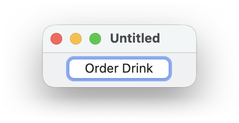
Here’s a window with more controls:
gui.Window(
~title: "Recipe",
gui.VPanel(
~margin: [10, 10],
~spacing: 10,
gui.HPanel(
gui.Checkbox("Lime"),
gui.Checkbox("Coconut")
),
gui.Choice(~label: "Finish",
["Mix",
"Drink It All Up"]),
gui.Button("Order Drink")
)
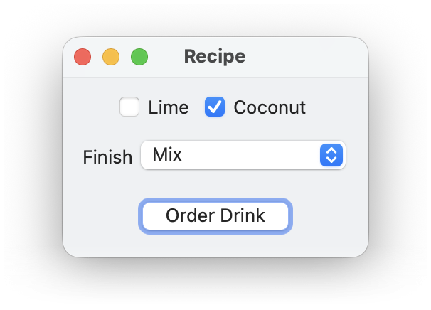
Although the window has many controls, nothing happens when a user clicks the checkbox, popup choice, or button. Let’s give the controls names, so we can query their values after the window is closed, and let’s make the Order Drink button close the window by giving the button an ~action callback.
["Mix",
"Drink It All Up"])
def win:
gui.Window(
~title: "Recipe",
gui.VPanel(
~margin: [10, 10],
~spacing: 10,
gui.HPanel(
lime,
coconut,
),
finish,
gui.Button("Order Drink",
)
)
[lime.at_checked.value,
coconut.at_checked.value,
finish.at_selection.value]
The rendered GUI does not look any different in this case, but the user’s selected order is reported after the window is closed.
1.2 Connecting Controls via Observables
The previous example is still fairly simple, because the controls in the window are all independent. The reactive nature of gui helps when changing a control should affect another part of the window immediately.
There are two parts to creating a connection between GUI elements:
When a user manipulates a control, it triggers a callback that is provided as an ~action argument to the control’s constructor. The arguments to the callback depend on the kind of control. The ~action callback for a gui.Button takes no arguments, but the ~action callback for a gui.Checkbox or gui.Choice receives the new control state or selection.
To make some part of a view variable, supply an observable to the view constructor, instead of a plain value. Create an observable with gui.Obs. Internally, a GUI control will read the gui.Obs.value property of an observable and update the GUI when it changes. A callback can update an gui.Obs.value property using :=.
Here’s a first try at using a message observable for the label of a button. The button’s label changes whenever the text in a gui.Input control is modified by the user.
gui.Window(
gui.Input(init_name,
gui.Button(at_message)
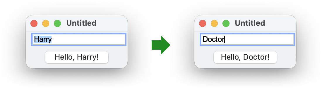
Using an observable may seem like the long way around, as opposed to just setting the button label imperatively in a callback. Part of the awkwardness here is that the way a button label is derived from a name really belongs to the button, not to the text-input widget. We can improve the above implementation by using the ~> operator, which creates a derived observable whose value changes whenever the original observable’s value changes. The left-hand side of ~> is the original observable, and the right-hand side is a function to convert the original observable’s value to the new observable’s value.
gui:
expose: ~>
gui.Window(
gui.Input(at_name,
Since it’s so common for a control’s action to update an observable, most control views provide an observable automatically. In fact, we used those observables at the end of Controls and Callbacks to get final control states via lime.at_checked.value, coconut.at_checked.value, and finish.at_selection.value. By convention, an automatic observable is a property whose name starts with at_. In the case of a gui.Input view, the property is gui.Input.at_content.
gui.Window(
name_input,
gui.Button(name_input.at_content ~> (fun (str): "Hello, " ++ str ++ "!"))
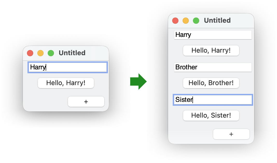
Observables can determine other properties of a control besides its label, including whether the control is enabled or the list of available choices in a gui.Choice. Even the children of a window or panel can be observables. For example, if we want to let a user add multiple greeters, we can make the child of a gui.Window be an observable whose value is a gui.VPanel.
fun make_greeter():
gui.VPanel(
name_input,
gui.Button(name_input.at_content ~> (fun (str): "Hello, " ++ str ++ "!"))
)
def at_greeters :: gui.Obs.of(List) = gui.Obs([make_greeter()])
gui.Window(
at_greeters ~> (fun ([greeter, ...]): gui.VPanel(greeter, ...)),
gui.HPanel(
gui.Button("+", ~action:
fun ():
at_greeters.value
~stretch: [#true, #false]
)
1.3 Combining Observables
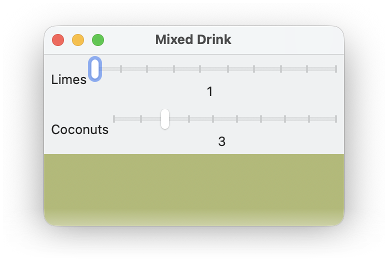
Often, a GUI includes elements whose presentation depends on multiple other controls. The gui.Obs.combine function is handy when multiple observables need to be merged into a single observable. It can convert a map with observable values into an observable of a map. For example, the values of two sliders can be combined to configure the drawing in a canvas.
let mix_color:
coconut_color.blend(lime_color with (alpha = limes/(limes+coconuts)))
gui.Slider(~value: init,
~label: label,
~min_value: 1,
~max_value: 10,
~stretch: [#true, #false],
~margin: [5, 5])
gui.Window(
~title: "Mixed Drink",
~size: [300, 200],
limes,
coconuts,
gui.Canvas(gui.Obs.combine({ #'limes: limes.at_value,
plot)
1.4 Views, State, and Rendered Controls
Going back to the multiple-greeter example, what would happen if we put the result of a single call to make_greeter multiple times in the at_greeters list? The window will start with two greeters, because each use of the view is rendered to a fresh panel, input field, and button. The two different renderings are not independent, however. Editing either input field adjusts both buttons, as well as the other input field.
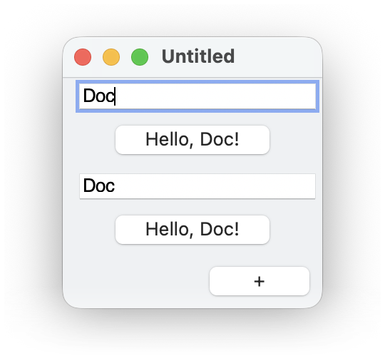
The two greeter renderings are connected because a single gui.Input.at_content observable is created when make_greeter calls gui.Input. Editing either rendered input field updates that same observable, so both rendered buttons see the change and adapt their labels.
Meanwhile, editing one input field adjusts the other input field because
a gui.Input view’s observable is reflected back to the input
field’s content. The intent of that reflection is to preserve the view’s
content if the view’s rendering is removed and recreated—
In short, a view can be rendered multiple times, either concurrently or sequentially and in different windows, but all renderings of the view share state that is part of the view. The shared state is always limited to an observable like gui.Input.at_content to hold a control’s value or selection. Some views, like gui.Button or gui.Window have no such observables and no internal state. Note that a view can have external state that is part of it’s input, such as an observable for a button’s label, but that is not part of the view’s own state.
Each rendering of a view can have state that is specific to the rendering. For example, each rendering of a gui.Button will appear at some location relative to its enclosing window, and it is independently in the process of being clicked or not. That rendering-specific state is accessible from a view only for the most recent rendering of the view, and some methods of views use the most recent rendering. For example, gui.WindowView.close closes the most recent rendering of a window, which means that the following window view makes sense only for a single rendering at a time.
def win:
gui.Window(
gui.Button("Order Drink",
)
1.5 Geometry Management
The gui library’s geometry management makes it easy to design windows that look right on all platforms, despite different graphical representations of GUI elements. Geometry management is based on containers, where each container arranges its children based on simple constraints, such as the current size of a window and the natural size of a button.
Containers include horizontal panels via gui.HPanel, which align their children in a row, and vertical panels via gui.VPanel, which align their children in a column. A gui.Window or gui.Dialog is also a container that acts like a vertical panel. Each container’s alignment determines whether it’s content is aligned horizontally to the left, center, or right and whether it is aligned vertically to the top, center, or bottom. Finally, each container or contained item can be stretchable horizontally, vertically, or both; the stretchability of a window determines whether the user can resize it. Nesting horizontal and vertical containers, adjusting alignment, and adjusting stretchability can achieve most useful layouts.
For example, suppose that we want a window that looks like this one,
where the window can be made wider by the user to fit a longer
name—
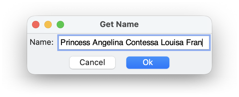
This layout can be implemented by putting the two buttons in a gui.HPanel and by making the window itself stretchable only horizontally. The window would have a reasonable starting width by default, but let’s opt to specify that the window should be at least 300 pixels wide, leaving the height up to the natural sizes of the window content.
gui.Window(
~title: "Get Name",
~min_size: [300, #false],
~stretch: [#true, #false],
gui.Input(~label: "Name:"),
~style: [#'default]))
As the example demonstrates, a stretchable container grows to fill its environment, and it distributes extra space among its stretchable children. If no children are stretchable, extra space is used before and after children. By default, panels are stretchable in both directions, whereas buttons are not stretchable in either direction, but the ~stretch argument to a constructor specifies a stretchability. The example also relies on #'center as the default horizontal and vertical alignment, but the ~stretch argument to a constructor can specify a different alignment.
A view has a graphical minimum size that is determined by its graphical representation and, often, the label associated with the view. In the case of containers, the minimum size also depends on its content. A view’s minimum size can be increased through a ~min_size argument to the view’s constructor. If ~min_size indicates a size smaller than the graphical minimum size in a dimension, the graphical minimum is used.
Spacing between children of a container can be controlled by the ~spacing argument to a container constructor like gui.HPanel or gui.VPanel, by the ~margin argument to a child constructor like gui.Button or gui.Checkbox, or both. Use gui.Spacer in a container as (potentially) stretchable space between other children.