class | ||||||||||||||||||||
| ||||||||||||||||||||
| ||||||||||||||||||||
property | ||||||||||||||||||||
The ~is_equal_value argument controls when changes to the input data are reflected in the contents of the field. The contents of the input field only change when the new value of the underlying observable is not == to the previous one. The only exception to this is when the textual value (via ~value_to_text) of the observable is the empty string, in which case the input is cleared regardless of the value of the underlying observable.
The ~value_to_text argument controls how the input values are rendered to strings. If not provided, value must be either a string? or an observable of strings.
The Input.at_content property returns an observable that is updated whenever the input’s value changes through an action (as also reported via action) or via content as an observable.
See View.LabelString for information about keyboard mnemonics in the ~label argument.
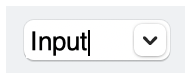
If the ~choices argument is not #false, it provides a list of suggestions via a popup menu. When a user selects an item in the popup menu, it is copied into the text field.
The ~style list must contain exactly one of #'single and #'multiple.
See Geometry Management for information about ~margin, ~min_size, and ~stretch.
The ~window_callbacks argument configures callbacks that are common to all WindowChildViews. See WindowCallbacks for more information.
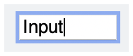
#'single: Shows a single line of text input, and treats the Enter or Return key as a special event. The input content is not automatically prevented from containing a newline character in pasted text, however.
#'single: Shows multiple lines of text input, and creates a new line of text in response to the Enter or Return key.
#'password: Renders characters typed into the input field as bullets.
#'horizontal_label: When the input field has a label, show it to the left of the field. Horizontal label placement is the default if #'vertical_label is not specified, and #'horizontal_label and #'vertical_label are mutually exclusive.
#'vertical_label: When the progress gauge has a label, show it above the gauge.