1.5.1 Coefficient paths
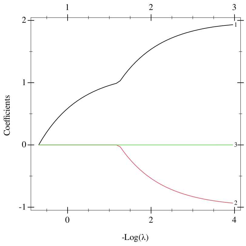
The small illustrative dataset below has a response that is exactly y = 1 + 2x₁ − x₂, and a third predictor, x₃ = x₁², that carries no signal. plot-coefficient-path plots its path as R’s plot(fit, label = TRUE) does:
> (define X '((1.0 2.0 1.0) (2.0 1.0 4.0) (3.0 4.0 9.0) (4.0 3.0 16.0) (5.0 6.0 25.0) (6.0 5.0 36.0))) > (define y '(1.0 4.0 3.0 6.0 5.0 8.0)) > (define path (elnet-path X y)) > (plot-coefficient-path path #:label #t)
To read it as R users do:
Each curve is one coefficient, as a function of λ. The x axis is −log λ: the largest λ of the path, at which every coefficient is zero, is at the left, and the penalty weakens to the right.
A coefficient that is zero along the whole path has no curve. The others are coloured as R colours them, cycling through the first six colours of R’s palette, and #:label labels each at the right-hand end of the path with the predictor’s position, counting from 1.
The axis along the top counts the nonzero coefficients at the positions of the ticks below it.
Read from the left, x₁ enters the model at once. x₂ enters at −log λ = 1.26, where the curve of x₁ bends, and the two coefficients then grow towards their least-squares values, 2 and −1. The irrelevant x₃ enters only over the last few λ, with a coefficient below 0.001: its curve looks flat, but the count along the top reaches 3.
1.5.1.1 Lasso and elastic net
The elastic net fits the same data with #:alpha 0.5, as the elastic-net example does:
> (define enet (elnet-path X y #:alpha 0.5)) > (plot-coefficient-path enet #:label #t)
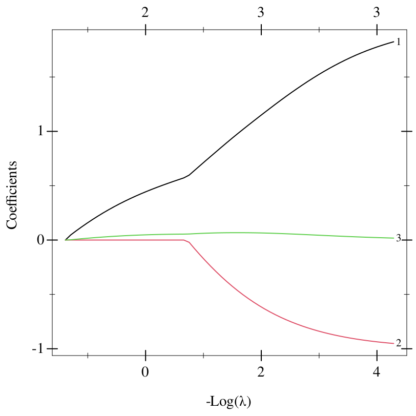
The ridge part of the penalty spreads weight across correlated predictors, and x₃ = x₁² is strongly correlated with x₁. So x₃ enters together with x₁, at the start. Its coefficient peaks near 0.07 and shrinks again as the penalty weakens and x₁ takes over, while x₂ enters at −log λ = 0.75. The lasso, which has no ridge part, picked x₁ alone. Correlated predictors shows the same effect in single fits.
1.5.1.2 The x axis
#:xvar chooses the x axis, with R’s names:
'lambda, the default, is −log λ. With #:sign-lambda 1 it is log λ, and the path runs from right to left.
'norm is the L1 norm of the coefficients, the sum of their absolute values. For the lasso it is the budget of the constrained form of the problem.
'dev is the fraction of the null deviance explained, the path’s glmnet-path-dev-ratio.
> (plot-coefficient-path path #:xvar 'norm)
> (plot-coefficient-path path #:xvar 'dev)
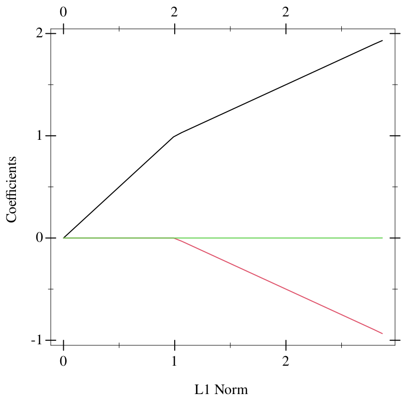
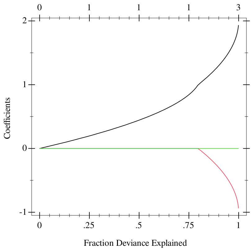
Against the deviance ratio, the curves rise steeply at the right, where the last few percent of deviance cost large changes in the coefficients. That is where the fit starts to overfit when the data are noisy.
Before version 4.1-9, R’s default was 'norm. R glmnet 4.1.10, which glmnet/plot follows, defaults to −log λ.
1.5.1.3 Labels
#:label also takes the names to use for the curves: a list with one name per predictor, or a design-matrix? whose column names are used, such as the one the path was fitted to:
> (define D (rows->design-matrix X #:column-names '(x1 x2 x3))) > (plot-coefficient-path (elnet-path D y) #:label D #:sign-lambda 1)
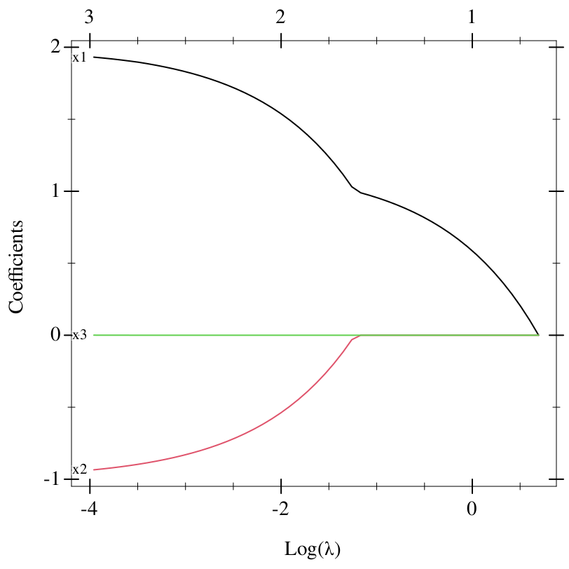
With #:sign-lambda 1, the path ends at the left, and so do the labels. Where R cuts off labels that run past the edge of the plot, these plots widen the x axis until the labels fit.
A formula-model fitted by formula-path or formula-cv knows its predictors’ names, so #:label #t labels its curves with them:
> (define table (list (cons "y" y) (cons "x1" (map car X)) (cons "x2" (map cadr X)) (cons "square" (map caddr X)))) > (define named-path (formula-path (~ y all) table)) > (plot-coefficient-path named-path #:label #t)
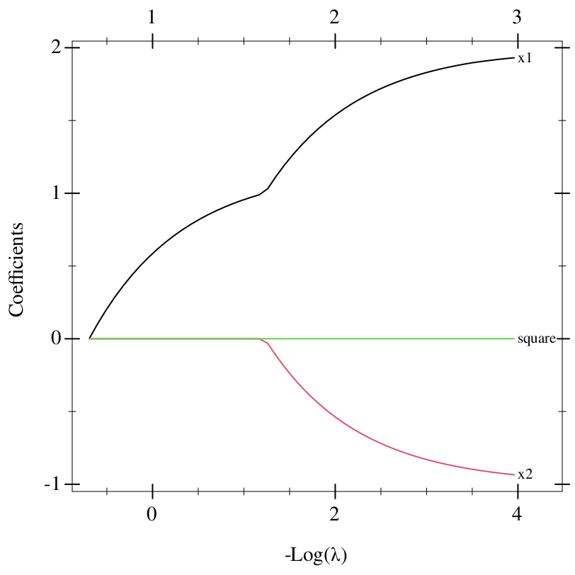
For the multi-response family, each plot’s y-axis label names its response, as R names it by the column of y, and for a multinomial formula model whose response holds strings, symbols or booleans, its class, as R names it by the level of a factor y (see Categorical responses).
1.5.1.4 Several classes or responses
For the multinomial family, R draws one plot per class, and for the multi-response Gaussian family, one per response. plot-coefficient-path stacks them into one picture, top to bottom, each the given width and height. The top axis of each counts that class’s nonzero coefficients:
> (define X3 '((1.0 1.0) (2.0 1.0) (1.0 2.0) (2.0 2.0) (5.0 1.0) (6.0 1.0) (5.0 2.0) (6.0 2.0) (3.0 5.0) (4.0 5.0) (3.0 6.0) (4.0 6.0))) > (define classes '(0 0 0 0 1 1 1 1 2 2 2 2)) > (define mpath (multinomial-path X3 classes)) > (plot-coefficient-path mpath #:height 250 #:label #t)
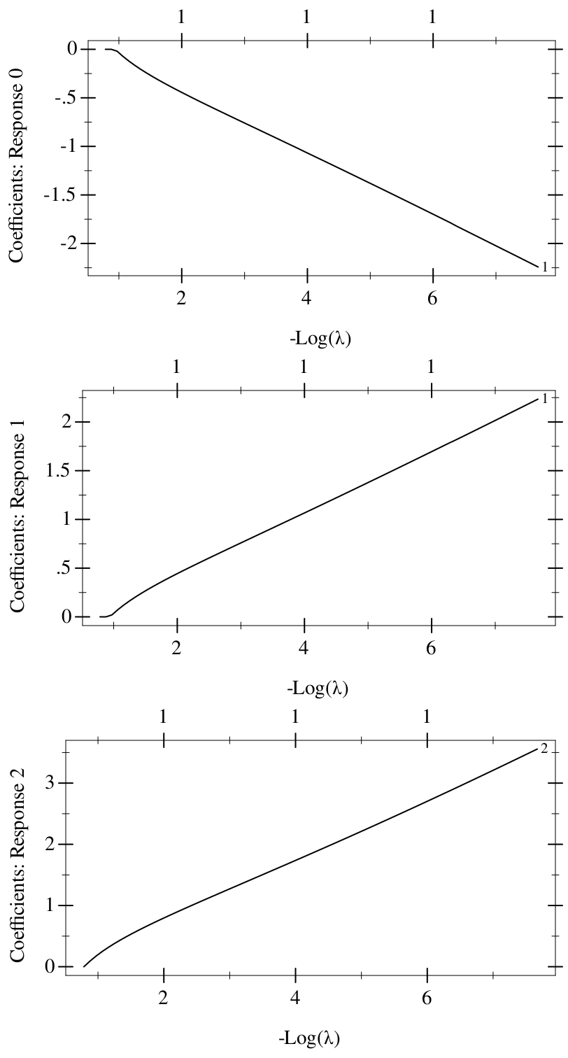
The classes are separable, so the coefficients grow without bound as the penalty weakens, until the path stops once the deviance ratio passes 0.999. Classes 0 and 1 split on x₁, with opposite signs, and class 2 on x₂.
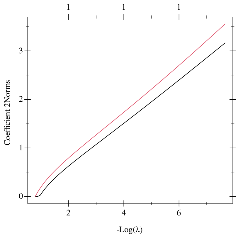
#:type-coef '2norm draws one plot instead, of each predictor’s 2-norm across the classes, (Σk β_{jk}²)^{1/2}. Its top axis is the mean of the classes’ counts, rounded to one decimal place (for the multi-response family, whose responses share their nonzero coefficients, the first response’s count):
> (plot-coefficient-path mpath #:type-coef '2norm)