class | |||||||||||||||||||
| |||||||||||||||||||
| |||||||||||||||||||
property | |||||||||||||||||||
The TabsPanel.at_selection property returns an observable that is updated whenever the panel changes through an action (as also reported via action) or via selection as an observable.
The choice_to_label function converts an item in choices to a label to be shown for the tab, and choice_equal defines equality for choice identities. By default, choices is expected to be a list of View.LabelString, since choice_to_label is the identity function.
When the tab selection changes, action is called as
action(what, choices, selected)
where what describes the action, choices is the list of choices at the time of the action, and selected is the tab (if any) selected after the action.
To change the content of a TabsPanel based on its selection, supply a child that is an observable derived from one supplied as selection.
enumeration | ||||||
|
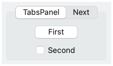
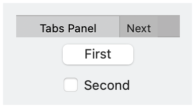
#'no_border: No border is drawn around the panel content. A borderless tab panel typically has a different look for its tabs, too.
#'can_reorder: Allows the user to reorder tabs by dragging them.
#'can_close: Allows the user to close tabs by clicking a close icon on a tab.
#'new_button: Include a button to create a new tab, if supported. A tab-creation button is always available with #'flat_portable.
#'flat_portable: Use a platform-independent implementation of the tab control, which provides more consistent functionality and style across platforms.

